Blog Archive

Monday, January 9, 2017

2016 WF9 - a simulation based on Jan 5th orbital params

On Jan 5th, I downloaded the orbital parameters of asteroid 2016 WF9 and their uncertainty from the Horizons Web interface:

param     value        1-sigma

a             2.8729806 0.00200340
e             0.6582656 0.00022291
i            14.9994893 0.00329270
w        342.4286190 0.00216310
om      125.4222393 0.00428050
M        353.6898676 0.00394660

In spite of the fact that the uncertainty is still very high, I tried to make a simulation generating 100 virtual asteroids to see how many of them in the past would seem to come from a distance greater than 100 AU (cometary origin).

First, I used the R programming environment to generate the virtual asteroids.
An obvious check is that the mean value of their orbital parameters must be almost equal to the nominal values of asteroid 2016 WF9 and their standard deviation should be also almost equal to the uncertainty shown above.

In fact, looking at the virtual asteroids, I got:

a     mean     2.8729   sd 0.002
e     mean     0.6583   sd 2e-04
i      mean   14.9988   sd 0.0035
w    mean 342.4285   sd 0.0023
om  mean 125.4218   sd 0.0046
M    mean 353.6903   sd 0.004


As a second step I used the Mercury6 simulator by John E. Chambers, to simulate the past 1e8 days, output interval 100 days (hybrid algorithm).
The program simulated the behaviour of 101 asteroids (100 virtual asteroid + the "real" asteroid):

The result was that about 60 virtual asteroids would seem to have a cometary orgin (i.e. there was a time in the past when their distance from the sun was grater than 100 AU).

The earliest date is about 37500 years ago, the oldest date is constrained by the simulation period (about 275000 years ago) and the median value is 155000 years ago.

(for curiosity: the nominal orbital values of 2016 WF9 itself tells us that this can be a comet arrived 76000 years ago).

This is the graph showing the arrival time of the 60 virtual comets:


In the next weeks, when the orbit of asteroid  2016 WF9 will be better defined, I would like to repeat the simulation to see if and how much the simulation results will be different.

Kind Regards,
Alessandro Odasso


Citations

      Mercury Simulator - Mercury6
      J.E.Chambers (1999) ``A Hybrid
      Symplectic Integrator that Permits Close Encounters between
      Massive Bodies''. Monthly Notices of the Royal Astronomical
      Society, vol 304, pp793-799.

Thursday, December 22, 2016

Asteroid H mag vs perihelium - ternary maps

Inspired by these beautiful examples, I have tried to use the ggtern R package to draw a few ternary maps showing how the H mag of various asteroid families varies as a function of q, i.e. the perihelium distance.

As usual, the starting point ...

Friday, October 14, 2016

Extreme TNOs - H mag

Let's apply the same approach described in the previous posts to the TNOs.

I downloaded some days ago a list of 2298 TNOs from the Horizons Web-Interface.

After reading it in an R dataframe, I have plotted the Spearman correlation versus Tisserand parameter with respect to a generic body with ap varying between 20 AU and 1000 AU. Important: I added a filter so to include ONLY asteroids with T <=3 ... this implies that the numerosity of the asteroids is not constant along this plot.

After some trials, it seems to me that there is a moderate correlation (better: anti-correlation) for ap = 324 AU (red vertical line).
This is visible in a rough but clear way if you just make a boxplot showing the different H mag distributions in the first and second half of the Tisserand range.


It must be said that the total number of TNOs in this plot is only 45: so I am not sure whether this is significant.

It must also be said that these 45 asteroids are very interesting: among them we can find Sedna and other famous Extreme TNOs that are being studied extensively because their orbits might have been shaped by an unknown massive planet waiting to be discovered.

We can note that the 45 asteroids have a>136 aU and e>0.677
> tapply(z$a,list(z$T324),min)
    FALSE      TRUE
 30.12661 136.09255
> tapply(z$e,list(z$T324),min)
    FALSE      TRUE
0.0000000 0.6776645

Another interesting aspect is described below.

45 TNOs - H Mag depends on Tisserand vs outer planets
Let's calculate the Tisserand parameter Tn with respect to Neptune.
After that we can flag every asteroid TNOs as Tn_le_3 or Tn_gt_3 depending on whether Tn is less than 3 or greater.

Furthermore: we repeat this process for Uranus, Saturn and Jupiter. 
In the end, every asteroid is flagged as follows:
  • Neptune:  Tn_le_3 or Tn_gt_3
  • Uranus - Tu_le_3 or Tu_gt_3
  • Saturn -  Ts_le_3 or Ts_gt_3
  • Jupiter - Tj_le_3 or Tj_gt_3
Of course, following the same convention, all our 45 TNOs have T324_le_3: this is how we chose them.

This is the boxplot showing H mag of the 45 TNOs depending on the combination of the above flags:
As you see, something quite peculiar (at least for me!) is going on:
  • the brightest TNOs are those who have any Tisserand parameter with respect to outer planets greater than 3.
  • when Neptune comes in (I mean: Tn<le_3), the asteroids get darker
  • when Neptune and Uranus come in ... the asteroids get darker
  • when Neptune, Uranus and Saturn come in ... same as above ... only 1 asteroid.
  • when also Jupiter come in ... we find the darkest TNOs of this group of 45 TNOs.

This is something that I can not explain: 
  • is this an expected / known result?
  • is it a ... statistical fluke?

Cheers,
Alessandro Odasso


Tuesday, October 11, 2016

Amor - a summary plot of H vs Tisserand's parameter - Tp < 3

This post continues from the previous one.

Let's take again the plot H  mag vs Tisserand's parameter with respect to Earth (ap=1 AU). 

ONLY those Amors with TEarth<3

We have already seen this plot, we just add a few labels to count them:

We have also seen that most of these Amors have also Tisserand's parameter with respect to Jupiter, Venus and Mars <  3 (actually, I refer to it as "Mars" but the exact value for which there was a relative greater correlation between H mag and Tisserand's parameter was ap = 1.65 AU).

A possible question is:how are these asteroids distributed  in the various TEarth quartiles?

For graphical purposes, I introduce the following abbreviations:
  • Tm = TRUE - Tisserand's parameter with respect to Mercury < 3
  • Tv = TRUE - Tisserand's parameter with respect to Venus < 3
  • Tma = TRUE - Tisserand's parameter with respect to Mars (better: ap =1.65 aU) < 3

This is the result:


I do not know enough about statistic to say that the above is really significant, but I can give you my feeling.
It seems to me that:
  • in TEarth quartile Q2, Q3 and Q4: those Amors having Tma < 3 (red) tend to be brighter than the others not having Tm or Tv < 3 (green)
  • in TEarth quartile Q1 and Q2: those Amors having Tma < 3 and Tv < 3 (yellow) tend to be slightly darker than those having only Tma < 3 (red)
  • in TEarth quartile Q1: those 79 Amors having Tm<3 (and also Tv and Tma <3) tend to be the brightest.

Below, you can see a table showing the numerosity (as also shown in the labels displayed in the plot) and the median and sd of every group:

Numerosity
> t(tapply(pe$H,list(pe$tsquartile,pe$Tm:pe$Tv:pe$Tma),length))
                  [-0.15,2.82] (2.82,2.93] (2.93,2.97] (2.97,3]
FALSE:FALSE:FALSE           NA           4          33       79
FALSE:FALSE:TRUE           213         871         884      838
FALSE:TRUE:FALSE             1           2          NA       NA
FALSE:TRUE:TRUE            624          40          NA       NA
TRUE:FALSE:FALSE            NA          NA          NA       NA
TRUE:FALSE:TRUE             NA          NA          NA       NA
TRUE:TRUE:FALSE             NA          NA          NA       NA
TRUE:TRUE:TRUE              79          NA          NA       NA


Median
> t(tapply(pe$H,list(pe$tsquartile,pe$Tm:pe$Tv:pe$Tma),median))
                  [-0.15,2.82] (2.82,2.93] (2.93,2.97] (2.97,3]
FALSE:FALSE:FALSE           NA       23.85        24.0     24.6
FALSE:FALSE:TRUE          19.7       20.60        22.9     23.6
FALSE:TRUE:FALSE          23.6       24.15          NA       NA
FALSE:TRUE:TRUE           20.1       23.10          NA       NA
TRUE:FALSE:FALSE            NA          NA          NA       NA
TRUE:FALSE:TRUE             NA          NA          NA       NA
TRUE:TRUE:FALSE             NA          NA          NA       NA
TRUE:TRUE:TRUE            19.2          NA          NA       NA

Standard deviation
> t(tapply(pe$H,list(pe$tsquartile,pe$Tm:pe$Tv:pe$Tma),sd))
                  [-0.15,2.82] (2.82,2.93] (2.93,2.97] (2.97,3]
FALSE:FALSE:FALSE           NA   0.9832238    1.984962 2.098781
FALSE:FALSE:TRUE      2.153851   2.4985271    2.592066 2.609018
FALSE:TRUE:FALSE            NA   1.2020815          NA       NA
FALSE:TRUE:TRUE       2.234240   2.1410988          NA       NA
TRUE:FALSE:FALSE            NA          NA          NA       NA
TRUE:FALSE:TRUE             NA          NA          NA       NA
TRUE:TRUE:FALSE             NA          NA          NA       NA
TRUE:TRUE:TRUE        1.967811          NA          NA       NA


Cheers,
Alessandro Odasso

Saturday, October 8, 2016

Amor - H mag vs Tisserand (ONLY Tp < 3)

I refer to my previous post. Following some comments from Alan Harris, I have re-drawn the relation H mag vs Tisserand with respect to a planet with generic semi-major axis ap taking into account ONLY those asteroids that have Tp < 3.

Amor - Method 1
Method based on Spearman correlation.

Having filtered only those asteroids that have Tp < 3, I have to restrict the range where the semimajor axis ap can vary:

0.35 AU <= ap <= 3 AU

For the purpose of the next plot, this is a table showing the orbital parameters of the planets:


Semimajor
Axis
(AU)
Orbital
Period
(yr)
Orbital
Speed
(km/s)
Orbital
Eccentricity
(e)
Inclination
of Orbit
to Ecliptic
(°)
Rotation
Period
(days)
Inclination
of Equator
to Orbit
(°)
Mercury 0.3871 0.2408 47.9 0.206 7.00 58.65 0
Venus 0.7233 0.6152 35.0 0.007 3.39 -243.01* 177.3
Earth 1.000 1 29.8 0.017 0.00 0.997 23.4
Mars 1.5273 1.8809 24.1 0.093 1.85 1.026 25.2
Jupiter 5.2028 11.862 13.1 0.048 1.31 0.410 3.1
Saturn 9.5388 29.458 9.6 0.056 2.49 0.426 26.7
Uranus 19.1914 84.01 6.8 0.046 0.77 -0.746* 97.9
Neptune 30.0611 164.79 5.4 0.010 1.77 0.718 29.6
 This is the plot showing the correlation between H mag and Tp calculated for various values of semimajor axis ap expressed in AU:
I have added the following vertical lines, showing the ap of the planets:
  • blue line - Mercury
  • green line - Venus
  • red line - Earth
  • magenta line - Mars
I wonder whether the planets are truly responsible for the peaks that we see in this plot.
This is probably true for Earth, because the peak is located at ap = 1.0 AU
Not clear if we can claim that this is true for Mercury and Venus.
In the case of Mars, this is less convincing: the peak next to Mars is not located at ap=1.52 AU but slightly greater.

Boxplot for ap=0.3871 AU

we only have 79 asteroids, with tp < 3, belonging to these Tp quartiles.
> summary(p1$tsquartile)
[-0.299,2.34]   (2.34,2.58]   (2.58,2.89]      (2.89,3]
           20            20            19            20


Boxplot for ap=0.7233  AU
In this case we have 746 asteroids with T<3
> summary(p1$tsquartile)
[-0.198,2.68]   (2.68,2.85]   (2.85,2.94]      (2.94,3]
          187           186           187           186

Boxplot for ap=1.0 AU
In this case we have 3668 asteroids with T<3
> summary(p1$tsquartile)
[-0.15,2.82]  (2.82,2.93]  (2.93,2.97]     (2.97,3]
         917          917          917          917


Boxplot for ap=1.65 AU
It turns out that the peak next to Mars semimajor axis is located at about ap= 1.65 AU
In this case we have 5617 asteroids with T<3
> summary(p1$tsquartile)
[-0.0765,2.66]    (2.66,2.75]    (2.75,2.83]       (2.83,3]
          1405           1404           1404           1404


Finally, I would like to see if the method2 based on Chi-squared test gives a similar answer.

Amor - Method2
Method based on Chi-squared statistic (see previous post):

In this case the effect of Mercury (if real) can not be seen.
Much more clear, if real, the effect of Earth and Mars ... some doubts about Venus.


Cheers,
Alessandro Odasso

Thursday, October 6, 2016

Amor asteroids - H mag vs Tisserand parameter

As seen in the previous blog where I focused on Apollos, I am now going to do the same for Amors: look for any relation between H mag and the Tisserand parameter with respect to a generic body with semi-major axis ap.


T_{P}\ ={\frac  {a_{P}}{a}}+2\cdot {\sqrt  {{\frac  {a}{a_{P}}}(1-e^{2})}}\cos i

The objective is to see what happens as ap changes in a given range.

Two simple ways to do this:
  • method1: calculate the (spearman) correlation between H mag and Tp, plot the result for many values of ap.
  • method2: divide the H mag and Tp range into quartiles; then, calculate the Chi-squared statistics on the resulting contingency table. Plot the result for many values of ap.

These two methods give almost the same result in the case of Apollo asteroids.
What is very strange, at least for me, is that these two methods give a different answer in the case of Amor asteroids.

In the following sections, I will describe in more detail:
  • Apollo - method1
  • Apollo - method2
  • Amor - method1
  • Amor - method2 
  • appendix (more graphs showing H mag vs others orbital parameters)

Apollo - method1
We calculate the spearman correlation and plot it against many values of ap. We search for minimum or maximum.
This method and the graphical result has been described in the previous blog.

Apollo - method2
I did not applied this approach in the previous blog, so I describe it in detail and I show the result.

First, we divide the H mag into quartiles (H-quartiles).
Then we calculate the Tp param for all asteroids and we divide the resulting range into quartiles (Tp-quartiles).
After that, we build a contincency table showing H-quartiles vs Tp-quartiles and, finally, we calculate the Chi-squared statistic.

The idea is just this: let's imagine for a moment that there is absolutely no relation between H mag and Tp. In such a case the Chi-squared statistic would be zero because there would be no difference between the observed values and the expected values, the latter being, by definition, the values that would be displayed when no relation exists. On the contrary, the greater the Chi-squared statistic and the greater the difference of H mag distributions between the Tp quartiles.

In order to implement all the above in R, besides reading the orbital parameters values downloaded from Horizons Web-Interface in a dataframe, we need a couple of user defined functions:

func_t
function(ap,a,e,i){ap/a+2*(a/ap*(1-e^2))^(1/2)*cos(i/180*pi)}

The above function just implements the Tisserand formula.

func_t_h_chisq
function(ap){p$ts<-func_t(ap,p$a,p$e,p$i);p$tsquartile<-factor(cut(p$ts, fivenum(p$ts), include.lowest = T));return(chisq.test(with(p,table(tsquartile,hquartile)))$statistic)}

All asteroids parameters are in a dataframe called p.
The above function calculates the Tp values (calling the first function) for all asteroids in the dataframe p: then it calculates the quartiles (cut and fivenum instructions), the contincency table (table instruction) and the Chi-squared statistic.

In order to see the result, all we have to do is define a range for ap (lets say 0 <= ap<=30 AU), loop calling the function and plot it:

therange<-seq(0.01,30,0.01)
plot(therange,sapply(therange,function(x) {func_t_h_chisq(x)}),type='l',xlab="ap (tisserand param)",ylab="H-quartiles vs Tp-quartiles - Chi-squared statistic",main="Apollo asteroids")


The maximum correlation is found for ap=1.03 AU
I think that this result is almost the same we achieved with method1 where we got ap = 1.01 AU.
More important: the plot seems smooth, there is a clear maximum.

Amor - method1
See previous blog for R instructions.
This is the plot showing how the correlation varies depending on the choiche of ap:
The maximum correlation in the case of Amors is found for ap = 2.07 AU
However, the overall behaviour is "flat" compared to the bigger variations that we saw in the case of Apollos.
In fact, the boxplot shows some differences (but not so many!) in the distribution of H depending on Tp quartiles:


Amor - method2
Following the same approach already described for Apollo asteroids, in order to see the result, all we have to do is define a range for ap (lets say 0 <= ap<=30 AU), loop calling the function and plot it:

therange<-seq(0.01,30,0.01)

plot(therange,sapply(therange,function(x) {func_t_h_chisq(x)}),type='l',xlab="ap (tisserand param)",ylab="H-quartiles vs Tp-quartiles - Chi-squared statistic",main="Amor asteroids")


This is surprising!
There is a relative minimum for ap = 1.29 AU
There are two relative maxima for ap = 1.0 AU and ap = 1.94 AU

We do not get once again the value ap=2.07 AU that was found before using the correlation method.

Let's see the corresponding boxplots to see if we have smaller differences for ap = 1.29 AU and much greater differences for ap = 1.0 AU and ap = 1.94 AU

boxplot ap=1.29 AU (minimum)
This boxplot below is done for ap=1.29 AU and, in fact, the differences of H distributions depending on different quartiles are small (with a notable exception for the 1st Tp quartile, where Amor asteroids are brighter.

boxplot ap=1.00 AU (maximum)
This boxplot below shows what happens for ap =1 .00 AU where we can see more differences compared to the previous one (although it seems that Q1 and Q4 are more similar):


boxplot ap=1.94 AU (maximum)
This boxplot below shows what happens for ap =1 .94 AU

In this other case, there is still some difference although this time Q2 and Q3 are more similar.
The trend seems consistent with what we have see before for ap=2.07 that was found using the correlation method.

appendix
As already done for Apollo in the previous blog, let's see other graphs for Amors:
  • H mag vs inclination
  • H mag vs perihelium

H mag vs inclination
Higher inclined Amors are brighter


H mag vs perihelium
Amors with greater perihelium (Q4 quartile) are brighter.
This is the opposite compared with Apollo belonging to their Q4 quartile that, on the contrary, were typically darker.


Cheers,
Alessandro Odasso

Thursday, September 29, 2016

Apollo asteroids - H mag vs Tisserand parameter

The Apollo asteroids' H mag is very much related to their inclination i and perihelium ( a*(1-e) ).

As the Tisserand's parameter is related to the orbital parameters (a,e,i), one may wonder whether the H mag is also related to the Tisserand distribution.

At first, I had been trying to look at the relation between H mag and Tisserand's parameter with respect to Jupiter.
The relation seems to be very weak, so I have tried to see if a different choice for the semi-major axis of the perturbing body can provide a stronger relationship.

The conclusion is that the stronger relation is found with a perturbing body semi-major axis equal to 1.01 AU (more or less ...Earth).

The analysis has been done with the package R (see R Core Team (2016). R: A language and environment for statistical computing. R Foundation for Statistical Computing, Vienna, Austria. ).

In the following sections, taking into account the Apollo asteroids, I will describe: 
  • data preparation 
  • H mag distribution
  • H mag versus inclination
  • H mag versus perihelium
  • H mag versus Tisserand's parameter with respect to Jupiter
  • investigation about a generic Tisserand's parameter 
  • the special case of Tisserand's parameter for a perturbing body with semi-major axis = 1.01 AU

Data preparation 
Apollo asteroids - I have downloaded the orbital parameters (a,e,i,w,om,t_jup) + H mag from JPL Small-Body Database Browser

After that, I read the file apollo.csv as a dataframe in R with the below instruction:

p<-read.csv("apollo.csv")

With the head and tail instructions you can look at the first rows and at the last rows of your data frame:

> head(p)
         a         e         i         om        w     H t_jup
1 1.078078 0.8268746 22.826863  88.012367  31.3817 16.90 5.298
2 1.245393 0.3353925 13.337454 337.216252 276.8695 15.60 5.075
3 1.367258 0.4359054  9.380703 274.339634 127.0826 14.23 4.716
4 1.470241 0.5599397  6.352955  35.739118 285.8483 16.25 4.415
5 2.259355 0.6061736 18.399653 346.487607 267.9952 15.54 3.298
6 1.460856 0.6146128 22.212986   6.640199 325.6343 14.85 4.336

> tail(p)
            a         e         i       om        w      H t_jup
7855 1.313828 0.3839697 10.811349 277.5693 123.8834 22.621 4.872
7856 1.355240 0.5707721  6.501750 294.3308 251.8823 24.329 4.672
7857 2.449819 0.6928541  1.086150 133.4694 231.7488 25.417 3.113
7858 1.306445 0.2387369 14.003415 288.4028 329.4405 23.046 4.927
7859 2.693641 0.6526003 10.463092 133.2149 213.9876 24.597 3.004
7860 2.804018 0.6672408  4.724818 183.5757 234.1325 20.400 2.946
So we read a total of 7860 rows.

With the summary instruction you can have a look at the data:

>summary(p)
       a                e                 i                   om        
 Min.   : 1.000   Min.   :0.02097   Min.   :  0.02262   Min.   :  0.019 
 1st Qu.: 1.294   1st Qu.:0.36393   1st Qu.:  4.24058   1st Qu.: 80.208 
 Median : 1.643   Median :0.51276   Median :  8.44792   Median :169.915 
 Mean   : 1.724   Mean   :0.49672   Mean   : 12.52270   Mean   :170.999 
 3rd Qu.: 2.090   3rd Qu.:0.62793   3rd Qu.: 17.46998   3rd Qu.:251.462 
 Max.   :17.827   Max.   :0.96910   Max.   :154.37505   Max.   :359.937 
       w                  H             t_jup     
 Min.   :  0.0348   Min.   :12.40   Min.   :1.316 
 1st Qu.: 92.4286   1st Qu.:20.00   1st Qu.:3.444 
 Median :189.4941   Median :22.60   Median :4.088 
 Mean   :182.7822   Mean   :22.57   Mean   :4.186 
 3rd Qu.:272.6443   3rd Qu.:25.17   3rd Qu.:4.878 
 Max.   :359.9882   Max.   :33.20   Max.   :6.064 


H mag distribution
With the following instructions you can display a rough density plot to have an idea about the data:
> library(ggplot2)
> ggplot(p,aes(H))+geom_density()

H mag versus inclination
The curious density shape shown above has an easy explanation.
Just take a look at the inclination quartiles (in short, I call them i_quartiles):

> i_quartiles<-cut(p$i,fivenum(p$i),include.lowest=T)
> ggplot(p,aes(H,col=i_quartiles))+geom_density()

> summary(i_quartiles)
[0.0226,4.24]   (4.24,8.45]   (8.45,17.5]    (17.5,154] 

1965                1965             1965              1965

So it seems that inclination alone is a good explanation for the H mag distribution shown above. Apollo asteroids belonging to the 3rd and 4th inclination quartiles have, by definition, a greater inclination: it turns out that they are brighter than those belonging to the 1st and 2nd inclination quartiles.

H mag versus perihelium
In this case, we calculate q = a*(1-e) and after that we find the perihelium quartiles:
> p$q<-p$a*(1-p$e)    
> q_quartiles<-cut(p$q,fivenum(p$q),include.lowest=T)


> summary(q_quartiles)
[0.0707,0.694]  (0.694,0.858]  (0.858,0.954]   (0.954,1.02]
          1965           1965           1965           1965


> ggplot(p,aes(H,col=q_quartiles))+geom_density()

Apollo asteroids belonging to the 3rd and 4th perihelium quartiles have, by definition, a greater perihelium: it turns out that they are darker  than those belonging to the 1st and 2nd perihelium quartiles.


H mag versus Tisserand's parameter with respect to Jupiter 

We can run the following instructions to get a rough scatter plot.
> ggplot(p,aes(H,t_jup))+geom_point()


This scatter plot is not particularly informative, it is hard to see any meaningful patterns!

So let's use the same approach seen before: let's make a plot based on T-Jupiter quartiles:
> tjup_quartiles<-cut(p$t_jup,fivenum(p$t_jup),include.lowest=T)

> summary(tjup_quartiles)
[1.32,3.44] (3.44,4.09] (4.09,4.88] (4.88,6.06] 

 1967        1965        1964        1964


 Similarly, we can draw a boxplot. Just run these commands:
ggplot(p,aes(tjup_quartiles,H,fill=tjup_quartiles))+\
geom_boxplot()+\ 
scale_x_discrete(labels=c("Q1","Q2","Q3","Q4"))


The Apollo asteroids belonging to the 1st T-jupiter quartile are brighter than the others.
A part from this, the distributions of the Apollo asteroids belonging to the 2nd, 3rd and a little less the 4th T-Jupiter quartiles are not so different as far as the median value is concerned.


We can find a rough numerical measure for the (not so great) difference between the various H mag distributions: we use R to calculate the spearman correlation.

> cor(p$H,p$t_jup,method="spearman")
[1] 0.2268667

I think the Spearman correlation in this case is better than the traditional Pearson correlation because we are not really hoping to find a linear relation, we would be happy to find a monotonic one.

Investigation about a generic Tisserand's parameter
Given the above result, one can wonder: what happens if we used a different Tisserand's parameter? Would we get a stronger correlation?

In order to answer, we can define two user defined functions:

Function1
func_t<-function(ap,a,e,i){ap/a+2*(a/ap*(1-e^2))^(1/2)*cos(i/180*pi)}

This first function just implements the Tisserand formula:

 T_{P}\ ={\frac  {a_{P}}{a}}+2\cdot {\sqrt  {{\frac  {a}{a_{P}}}(1-e^{2})}}\cos i

Function2
func_t_h_spea<-function(ap)\{p$ts<-func_t(ap,p$a,p$e,p$i);return(cor(p$H,p$ts,method="spearman"))}

This second function calls the first one and after that, once the Tisserand values are calculated for every asteroid, it returns the correlation coefficient between H and the generic Tisserand's parameter (given ap as input).

Now we can vary the semi-major axis ap of the perturbing body in a range of our choice ...let's say [0<ap<30] AU and plot the graph showing the variation of the correlation factor.

>therange<-seq(0.01,30,0.01)
>plot(therange,sapply(therange,function(x) {func_t_h_spea(x)}),type='l',xlab="ap used for tisserand param",ylab="Spearman correlation H vs Tisserand's param")


With the order instruction we can search for the exact ap value that maximizes the correlation;

> tail(order(sapply(therange,function(x) {func_t_h_spea(x)})),1)
[1] 101
> therange[101]
[1] 1.01


 We get ap = 1.01 AU

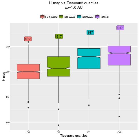
The special case of Tisserand's param with ap = 1.01 AU
Given the above result, we can calculate the quartiles of the Tisserand's parameter with respect to a perturbing body with semi-major axis 1.01 AU:

> ap=1.01
>p$ts<-func_t(ap,p$a,p$e,p$i);p$tsquartile<-factor(cut(p$ts,fivenum(p$ts), include.lowest = T))

>summary(p$tsquartile)
[-1.29,2.59]  (2.59,2.79]   (2.79,2.9]      (2.9,3] 

  1965             1965              1965         1965

Then, we can see the result in the usual graphical form:

> ggplot(p,aes(H,col=tsquartile))+geom_density()
It seems that our search for a better/stronger correlation has been successful: now we can observe a sharper separation between the various H distributions.

The same result is more clear with a boxplot:
ggplot(p,aes(tsquartile,H,fill=tsquartile))+\
geom_boxplot()+\ 
scale_x_discrete(labels=c("Q1","Q2","Q3","Q4"))+ggtitle("H versus Tisserand's param for ap=1.01")


In conclusion, there are a lot of outliers in the extreme quartiles but the middle half of the H mag distributions are now much better separated than when we used Tisserand's parameter with respect to Jupiter.

Cheers,
Alessandro Odasso